Can you introduce yourself, and say a little about what you do?
Hello, I'm Samantha Warren, a Croydon resident and a printed textiles designer. I run two creative businesses, one of which is Scene in Croydon which is an initiative celebrating Croydon though illustration and design. The other is Samantha Warren. The prints 'Coneflowers' and 'French Lavender' were drawn in the Age UK Croydon garden!
Your first contact with Age UK Croydon was your sharing of the Scene in Croydon colouring competition. Can you tell us more about that?
Scene in Croydon was born from a desire to challenge the perception of Croydon as a grey urban jungle by celebrating the beauty and diversity of the area through design. As a Croydon resident, I wanted to use my design skills to deliver this message and Colour Croydon was a great extension of this. It started as a simple creative activity for people stuck in doors during lockdown. I created colouring in sheets which people could download and colour in. I was then approached by The Museum of Croydon as they loved the idea and offered to host an online exhibition of the submitted artworks on their site. It was a great collaboration and so many Croydon residents took part, it was wonderful! I provided some of the colouring in sheets to Age UK Croydon for inclusion in their grocery bags which I thought might be a welcomed activity for customers.
You volunteered to help pack emergency parcels at our Food & Essentials Hub. Was there a reason you wanted to help Age UK Croydon specifically? How was your experience volunteering during the initial lockdown?
I recently became aware of the importance of services and support for the elderly as my father had a stroke in 2018. I live around the corner from Age UK Croydon and could see on social media that you were looking for volunteers to help with deliveries, donating food and packing bags. I had donated on a couple of occasions, and eventually inquired about becoming a volunteer. Vulnerable people in our community needed help, and I was lucky enough to be in a position to offer my support. I thoroughly enjoy being part of a positive and committed team, and helping to bring relief to people in the community.
Some of our food hub volunteers also helped to keep our garden watered during the summer, and you continued as a garden volunteer after the food hub closed. It’s very different to the hub – how have you enjoyed being a garden volunteer, as a local resident, Age UK Croydon volunteer, and artist?
I am really enjoying being a garden volunteer. I don't have a garden so from a purely selfish point of view, it's wonderful being outdoors, especially when we were only allowed for one hour a day of outdoor activity, and not allowed to stop or sit down. The garden allowed me outdoor time without the need to rush for fear of breaking the law. I do find gardening very therapeutic and it's been a much-welcomed activity which helps break up my week. It's rewarding to know that I am also helping Age UK Croydon to maintain their beautiful garden so that it's in good shape for when the community can return again. As an artist, downtime and headspace are really important ingredients in being able to create, so I thank Age UK Croydon for inviting me to help maintain the garden as it benefits me greatly too.
Sketching in the Age UK garden.
Drawing of the Coneflowers in the Age UK garden.
We are honoured that you have chosen to donate profits sales of one of your prints to Age UK Croydon. Why were we chosen?
I am really impressed by the service Age UK Croydon provide and I wanted to extend my support for the charity through my design work.
It also allows me to raise awareness of Age UK Croydon and promote the fantastic work you do to my creative network and customers.
Coneflowers print available here.
French Lavender print available here.
Croydon Heart print available here.
You often speak of your parents, and in doing so touch on things that are relevant to the work we do. You’ve spoken about your heritage, supporting your father after his stroke, your mother’s work as a carer, and your concerns for your family during lock down. Would you feel comfortable sharing some of this with our audience?
My dad is in his mid 70's and has slowed down since his stroke. He has always been a very active and independent man, so it's been a challenging time for him but my family are a close-knit team. We are lucky as we're all nearby and can chip in and help out if needed. But this is not the case for some elderly people and I think London can be quite an isolating place. That's why I think Age UK Croydon is so important and a real lifeline to many older people. My mother is a carer and has worked throughout the pandemic. I am very proud of her and I guess my desire to help is inspired by her.
]]>
Earlier this year I launched the first phase of my new homeware range, a collection of trinket dishes and coasters, all handmade in my Croydon studio. These new products represent an exciting new phase of my design journey. Using a material called jesmonite, I can now control the design and making process from start to finish, allowing me endless creative possibilities.
In this blog, I want to give a behind the scenes look at how I am using jesmonite to experiment, play and create new and exciting designs.
Collaborating with designers.
I love to collaborate with other designers and makers, and up until covid hit, this was a major source of inspiration for me. Working collaboratively allows me to learn about a different discipline and work behind the scenes in another maker's studio, we also get to share ideas, play to our strengths and it's a great introduction to a new customer base. In the past I've collaborated with many people, including Libby Ballard, Camilla Webb Carter , Skinny Vinny and MWMakes.
When covid struck, the lockdown restrictions made this way of working almost impossible. This pushed me to research other methods of production which didn't require kilns or other specialist machines which I didn't have access to.
At the time I was exploring new ideas for a new range of homewares. I wanted to produce durable and tactile pieces, and I needed a production technique that would give me vibrant colours and a clean finish. This line of investigation lead me to discover jesmonite.
What is Jesmonite?
Jesmonite is a fantastic material. It's a bit like plaster of Paris, whereby you mix a powder with a liquid to create a fluid which you can then pour into a mould. It's been around since the 1980’s, and has been widely used for making stage and film props. It has now become very popular among designer makers and was named 'Material of the Year' in 2017 at the London Design Fair. It's not surprising. Jesmonite is a versatile, non toxic and easy to use material, that sets quickly and has a low environmental impact.
(Tip: During lockdown, jesmonite was pretty hard to come by. I managed to purchase from Flints, a stage and film prop supplier).
Jesmonite also mixes extremely with pigment powders, which come in a wide range of colours. The ease of use, combined with the possibility to experiment with colour and tone, was nothing short of liberating for me. This process offers me a new level of creative freedom, allowing me to experiment with form, scale and colour all at once.
Creating homeware pieces with jesmonite.
Form and colour are so important in my product development.
Form.
Form is the beauty and utility of an object. It takes into account scale and weight, but also how something is used and how it can be made. For my jesmonite homewares, I wanted to start small, with everyday objects that are often under-considered. I began with coasters and trinket dishes, similar items with very different uses. I began by experimenting with different sized moulds, of varying depth and shapes - testing each one, using it for a few days and refining the shape and size as I went. This process of trial and test is really important as it allows me to craft the object down to the last detail. I know it's right when it looks good, but also feels good too.
Colour.
Colour is central to everything I do. The way I use it is very personal to me. It’s how I express mood and memory, transporting me to the place where I first discovered a certain colour combination or tone. No matter what kind of product I am designing, colour will always be vital for my creative process. Jesmonite can be coloured in endless ways, a dream come true for me.
Once I had my final coaster and dish forms, I began a series of colour tests, trying out different pigments and pouring techniques. The colour exploration really came to life when I started to reference an earlier collection of mine, 'Skye’. These designs were inspired by the Scottish landscapes, and recreating them in jesmonite required some abstraction but also a lot of control. I also developed a much looser marble technique, inspired by a book jacket marbling workshop I did in 2019. Both techniques were developed into the final collection of trinket dishes and coasters.
The end results can be found on my website here. Each piece is individually hand-poured, and one of a kind.
In 2019 I first started using natural pigments to create dip-dye designs that depict landscapes and coastlines. This natural dye process is not an exact science, and with each new print I never know quite what the end result will be. It requires you to jump in, trust the process and embrace the element of surprise. This kind of creative exploration is very freeing (and a little scary), and led me to create designs that I otherwise probably wouldn’t have.
Using natural dyes and natural fabric also produces deep colours and textures that are hard to replicate in paint and other drawing techniques. I see the natural world as a mosaic of texture and colour, and this way of seeing is central to my design style and expression.
During 2020, nature became a source of solice. Like many people, it gave me a sense of connectivity to the world and benefited (and continues to benefit) my well-being throughout lockdown. With time on my hands, I began rummaging through the thousands of images I have taken over the years of landscapes, leaves, plants, bark, moss, sea shells... until I came to a folder of images of one of my favourite places, Scotland.
I have explored Scotland previously in my Munro collection and Scottish landscape prints, but I find endless inspiration in the stunning natural beauty of its lochs, moors, mountains and coastline. In the midst of lockdown, this beauty and inspiration was even more potent.
I decided to revisit my natural dip-dye experiments and love of the Scottish landscape, and combine them with my digital design process. I scanned my numerous dip-dye swatches, juxtaposed them against selected photographs, and began to rework colours and layers to capture the atmosphere of the Scottish landscape. A style of print started to emerge that captured the scale and majesty of mountains and coastlines, with the texture and colour of rocks, lichen and plants.
The end result is the Skye collection of silk and leather bags. The final prints use earthy tones including a rusty orange, soft sandstone, moss green, and deep purples. These printed silk and leather clutch bags capture the depth and tone of the dip-dye technique, while the digital retouching allows me to enhance the compositions and textures present in the Scottish landscape. When combined with the simplicity of the clutch bag shape, these prints really stand out and pop with energy. Contemporary and stylish, these signature clutch bags are like holding a small piece of the Scottish landscape in your hands.
You can find the Skye Collection here.
]]>
Hair accessories are a passion of mine. I grew up in South London among friends from many different cultures and backgrounds. Hair was important to all of my friends, but we all had different challenges. Some friends had dry frizzy hair, some had uncontrollable curls, while I struggled with flat hair. I guess this created a sensitivity in me to the importance of hair as a cultural signifier and form of expression. How we style and dress our hair is as much of a statement as clothes and make-up we wear.
I chose to develop scrunchies because they are a hair styling essential that combines the expression of print design with the practicality of simple forms.
I make my scrunchies from silk because it's kind to all hair types and doesn’t tangle. It's also a fantastic material for digital printing, allowing for vibrant and tonal designs to really shine through.
I’m really excited about these new silk scrunchies. I usually make them using leftover fabric, but with Christmas close by and with the demand for scrunchies as gifts and stocking fillers ramping up, I thought I would produce them in a slightly different way. A lot of thought and effort goes into these products, so I’ve decided to give you all a sneak peek at my creative and production process.
Inspiration and design process.
My creative process always starts with nature. Here I've used watercolour paints and inks to create washed stripes that reference open and spacious landscapes, using deep colours and rich textures as a starting point. The way these colours bleed into each other is an effect that prints really well on silk.
I then scan my paintings into my computer, and working in Photoshop, I layer images on top of one another, experimenting with colour, scale and opacity features. Photoshop allows me to be playful with my designs, and gives me flexibility to explore many different directions, and go back several steps if I don't like the way a design is developing.
I've decided to go with this pattern.
After a lot of experimentation and refinement I end up with a final print design that can be put into repeat in preparation for printing onto silk.
Now to create a file for the digital printers. The fabric is 136cm in width, so I need to create a design file 136cm wide and as long as required to make the number of scrunchies I need.
I know from making scrunchies in the past, that I need three times the length of silk fabric to elastic.
In the top row, you can see that I have simply positioned my design side by side. After seeing the file like this, I decided to get rid of the very washy section and keep the more striped element of the design. I've then stretched the design file to create the exact length I need to make my scrunchies. You can see that the width of my design file is 136cm, to match the fabric width which will be fed through the digital printer.
The next step is to find a suitable fabric for printing my design. After flicking through the samples (here I use Silk Bureau) I decide to use silk habotai. This fabric has a lovely soft finish and is tightly woven so I know it will take the fine definition in my design well. It's also got the perfect weight that will puff up well in my scrunchies, while being opaque enough to hide the elastic inside.
A couple of weeks later, and my printed silk fabric has arrived, ready to be cut to size for making the scrunchies. I personally don't do my sewing anymore as I've found amazing local seamstresses who do a far better job than me, and it means I can concentrate on designing and developing new products. For this batch I sent my fabric to the very talented Tula Leanne.
Ta-daa! Here's the finished product. I love how soft and pouffy it is.
So there you have it. A little look behind the scenes at how I go from concept, to design, to final product.
Please do have a look at my silk scrunchie range and if you have any questions, feel free to comment or send me an email.
]]>
The next in our creative collaboration series features Michelle from MW Makes who creates handmade leather goods for the everyday. Recently, she has collaborated with textile designer and fellow Shopping with Soul member Samantha Warren on a range of leather accessories titled ‘Komorebi’.
We first met at a Crafty Fox market two years ago when we shared a table. It was the first market that Crafty Fox did at The Department Store in Brixton, as part of the London Design Festival.
We had a mutual respect and interest in each other's work and felt that the two styles would compliment each other really well, which they did!
I (Michelle) am leather crafter and Samantha is a print designer so we utilised our skills and combined these to make a collection of leather accessories. We created a range called 'Komorebi' which is a Japanese word referring to the sunlight filtering through the leaves. Samantha hand-painted each leather piece with leaves and branches and within the collection we created a twilight range (black print on black leather) and a dawn range (iridescence on natural leather).
Yes, it's allowed us to develop a range of products that appeal to our existing customers and also reach new customers.
There's a really great community amongst designer makers, who are always willing to give tips, so don't be afraid to ask!
Yes! We recently made a custom laptop case for a customer who really liked our original collection. The collection worked really well and we're both so passionate about design, it would be a pleasure to work together again.
You can find Michelle from MW Makes back at our next Crafty Fox Christmas Market where we return to The Department Store, Brixton on 23 & 24 November.
And find more amazing handmade products from both makers on their websites MW Makes and Samantha Warren London.
People often ask how I create my products. I’d love to say that it comes in a moment of inspiration, followed by a frenzy of productive designing and a smooth production process. The reality is much different. Designing new products is a constant process of inspiration, research, testing, and refinement… followed by more testing and refinement. With the recent launch of my travel wallets, I thought it would be a great opportunity to share my product development process with you.
Why did I decide to design a range of travel wallets in the first place?
The initial inspiration for a new product can come from anywhere. As someone who's always on the go and loves to travel, I struggled to find a practical travel wallet that could fit my passport and essentials and also looked stylish. I often get requests for wallets so I thought it would be a good idea to experiment with a new product that combines my own observations with the needs of my customers. Once I have identified a new product to explore, there are two main aspects to consider - the surface design of the prints and the technical design of the product itself. Both aspects are equally important and have to work in harmony to create the perfect balance of beauty and function.
Where did my print design inspiration come from?
My mind really opens up in new surroundings and I find so much inspiration in nature. I visited Mauritius in 2018 for my honeymoon and fell in love with the scenery and local wildlife, in particular, the shaggy palm trees and beautiful seashells.
Palm photos from my trip to Mauritius.
Observing seashells at the Shell Museum.
Above are images of the key inspirations for this collection. I came away from Mauritius really inspired and full of ideas, but it's only through lots of design work after the trip that a collection started to form and designs clicked into place.
Photographs from my trip to Mauritius.
I photographed lots of natural forms on my trip - flowers, landscapes, corals and fruits. Keeping the essence of my trip in mind, I decided to hone in on only a couple of key inspirations (palm trees and seashells). This helps to really explore and further my design work and not lose focus on too many visual references. I started to play around with my photographs, layering them up in Photoshop and digitally manipulating them to create unique designs that feel more in keeping with my brand.
Comparing design swatches and fabric quality.
How do I begin the process of designing a new product?
I work in tandem, developing my print designs and sketching up product shapes.
When I have selected my favourite print designs I then apply them onto fabric (in this case cotton) to check the colour and print quality. The cotton has a slight texture and I need to make sure that I'm not losing too much definition of my print designs.
Having my designs on fabric then allows me to manipulate the material into wallet shapes, which really helps me to visualise my designs as 3D objects. This is a really interesting and vital part of the process. What looks great as a flat print doesn’t always translate to a product shape. These early tests can completely change my preference of a print design, allowing me to refine each design in terms of colour, scale and details.
Printed fabric swatches.
With a rough idea of print selection, I can then start working closely with my manufacturers to develop my products. This way of working really pushes the product to the next level, and it’s great to collaborate with experts who have the knowledge and experience of how different materials and fabrics behave.
There are so many challenges with product development and the simplest of products can often be the most complicated to design. This is a lengthy process where I explore many variations of size, fabric weight, material textures and design details such as stitching and fixings.
I decided to use cotton and leather in this product as I have used this combination in my crossbody bags and it worked really well. However, my crossbody bags have different dimensions so I needed to tweak the weights of cotton and leather used to make my travel wallets which are smaller products.
Travel wallet sketches and ideas.
My first prototype had the right look and feel, but it was too small. I then increased the size, but I found that the materials I chose weren't working well together at a larger scale, and the wallet became flimsy.
Varying travel wallet dimensions using different leather weights.
I then tried using a more rigid leather inside the wallet and on the outer flap to help maintain the product shape. This combination gave the perfect rigidity and size to fit passports and boarding passes and allowed the wallet to fit comfortably inside my popular crossbody bags.
Comparing fabric weights and rigidity.
How do I decide which products to launch and which to cut?
With final prototypes working, I then like to engage with my customers to gather their feedback. I held a focus group and also released polls on Instagram to gauge interest in each design. It was a close call on a few but I whittled it down to the top two designs and decided to add in a best-selling print to the range.
So finally, after much development, the travel wallet collection was launched and looks like this :)
Final products. L-R: Clara, Abalone, Lagoona.
To view the travel wallets in store, click here.
To receive notifications of product launches and events, click here.
]]>
Wedding season is upon us and it's time to start looking for the perfect bag to go with your outfit.
I have designed a collection of bags which are perfect for weddings, especially if you're looking for an alternative to the usual satin and pearl number. As you know, I'm all about print! I've compiled some of my recommendations so you can add exciting colour and pattern to your look.
These bags the right size for your camera, wedding card and keys, and of course, they look great too. There’s a wide selection of designs to choose from; ranging from tropical brights to tonal abstract designs, have a look for the one that best suits your style. Head over to the bag section to see the full collection.
Each bag is individually hand made in London, UK, and features one of Samantha’s original pattern designs. The bags are beautifully tactile and are constructed using luxurious silk and soft leather in either black or tan.
Rita silk and leather bag.
L-R: Svana, Xavi and Rita clutch bags.
The Celia silk and leather bag. An abstract palm design in an eye-catching navy, red and white colour combo. This strong print is a perfect match for a classic look.
Attending a wedding in a garden setting? The striking pink and emerald green Xavi silk and leather bag would be perfect. Match the colours or pair with a loud clashing dress or a simple spotty outfit.
Hello from the Scottish Highlands.
The Quiraing in the Isle of Skye, Scotland. I love the craggy silhouette and contrasting shapes.
Photographs from the Scottish Highlands and Isle of Skye.
I was so inspired by the Scottish scenery and I knew I wanted to design a range inspired by the Scottish Highlands but I wasn't sure how to incorporate this into my brand so it would be in keeping with my other collections. I sketched some of the views using chalky pastels, roughly sketching out forms using lines and bold mark-making.
Sketches from Scotland.
Pastel sketch of Carbost, Scotland.
Scottish coastal sketch. I love the organic, dramatic coastline.
Scottish Highlands sketch.
After further research and producing a series of artworks, I wondered if there was a way I could merge my design research with the dyeing process. I love the winding valleys and towering mountains (munros as they're called in Scotland). I looked at various compositions from my photographs and started to link how these shapes could be created through dip-dyeing.
Photographic compositions of the Scottish landscape.
Composition planning.
I started to experiment with hand-dyed silk, playing with dip dyeing and painting, layering up colours and then stripping colour out. This was a fun but very time-consuming process that requires a lot of detailed note-taking and trial and error.
Each column represents one natural colour, and each segment is a variation of the colour by dipping it in various solutions including citrus, soda ash or iron water.
Testing reactions to bicarbonate of soda solution.
Further natural dye tests. Looking at reactions to soda ash, citric acid, iron and tin.
Dyeing silk with avocado seeds and lac and cochineal extracts. I need to keep monitoring the temperature and stirring the fabric to ensure an even coverage.
Bowls of various solutions (citric acid, soda ash and iron) to test reactions with natural dyed fabrics.
More testing...
Studio setting.
In the studio selecting the most effective dip dye experiments.
I started to refine what really worked. Through hours and hours of trial and error (over months), I whittled down my colour palette and found a technique which conveyed my vision of the Scottish Highlands and was in keeping with my design style and was really very beautiful.
This has been a very time consuming and challenging undertaking, but I believe that the makers and brands of today have a responsibility to find ways of making products that are as sustainable as possible, without compromising on style and function. Add to that the extra challenge of creating pieces which are affordable, in the hope to make sustainable products mainstream.
Further reading about natural dyeing:
Botanical Inks, Babs Behan
Wild Color, Jenny Dean
The Science of Teaching with Natural Dyes, Jeanne M Buccigross
I have recently been featured in Crafty Fox's 'Sustainability in Making' blog series. To read the full article, please click here.
Sign up to the newsletter here to hear more from Samantha Warren.
]]>
Markets have been a great springboard for my brand, but it hasn’t been easy and most of what I have learned has come from trial and error. Can I really stand up in front of a group of ambitious young designers and reveal that the secret is that there is no secret? Turns out I can, and it was a super useful exercise for me and the students.
I love working with young design entrepreneurs. It gives me great satisfaction that I can give something back to the professional community to which I belong, and will hopefully be a part of for a long time to come. But aside from a sense of self-satisfaction, it forces me to reflect honestly on my business and work.
I thought it would be a good idea to share some highlights from my talk. They might be useful for you if you're interested in trading at a market or perhaps you already do and would just like to read about another trader's experience. Either way, enjoy reading and I hope you find this useful.
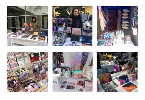
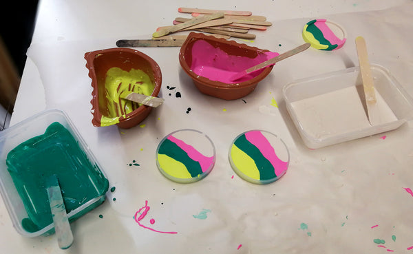
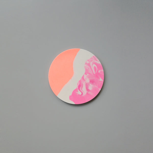
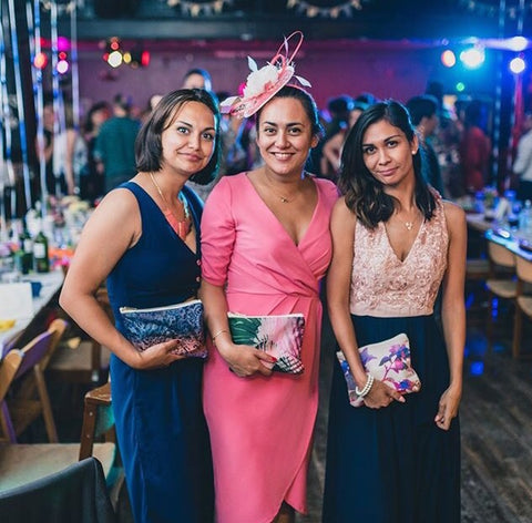
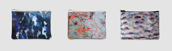
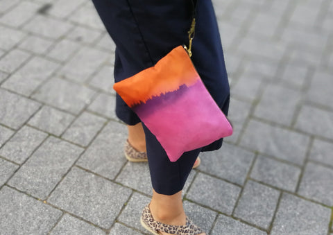
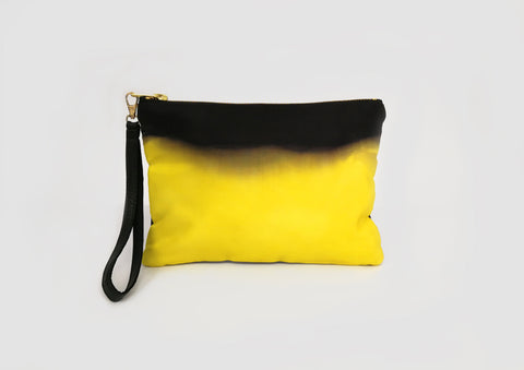
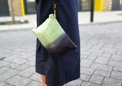
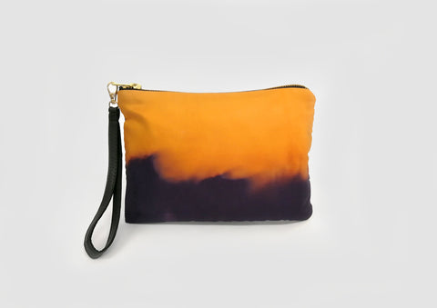
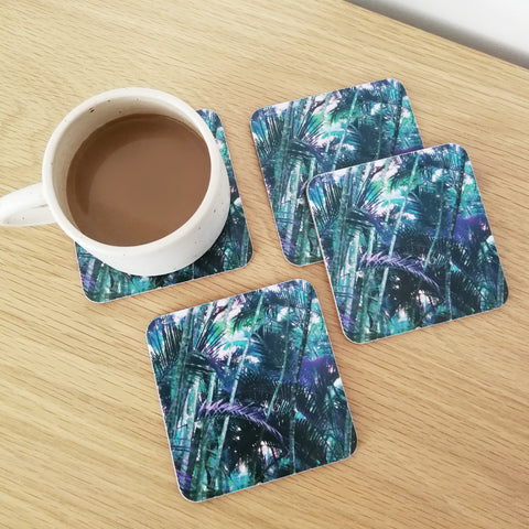
Some of my market stall setups.
How to choose a market location for you.
The market scene is really saturated, especially in London. It's hard to decide which one to book yourself in for as markets are so unpredictable at the best of times. How do you limit your risk of taking part in a market and select one that gives you the best chance of doing well?
List the markets you are thinking of applying for and visit as many of these as you can. This allows you to see what the other traders are selling and if there is someone else selling something similar to you. Sometimes markets won't accept similar brands, but if it's a large enough market they might well do. What's the footfall like? Are there many customers shopping? What kind of price points are there? Is it a bric-a-brac market or a more high-end market? Is it expensive to take part in?
I'd say between £30-£45 a day is an average London designer-maker market (including a 4ft-6ft table with gazebo). Ask the traders how they're finding it. Some might be a bit cagey, but if you introduce yourself as a fellow designer maker and that you're interested in applying, you should get the answers to help you decide.
I usually get involved with the London markets including the West Norwood Feast and the Crafty Fox Market. If you'd like to visit me at my next market, please check my events page.
Visual appeal.
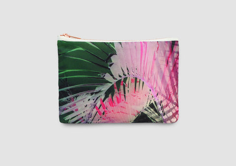
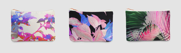
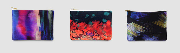
I've tried and tested quite a few visual setups and what I realised is, the simpler the better. Less is more. My products are quite busy - they're colourful and patterned and when I have too much product out, it just confuses customers. This approach works for me as it suits my products.
Think about what you're attracted to when you shop and how you would like to see products displayed. Having clear pricing, great visual merchandising and being available to answer questions is important.
Being approachable and friendly is really important. I think you do need to be a people person to enjoy trading at a market as engaging with customers plays a huge part in the day. There is so much to learn from your customers, and don't forget that they are the whole reason your business exists. Ask your customers questions like 'which designs do you prefer?', ask for feedback on new products, find out where else they shop/which other markets they visit. You might be interested in booking yourself into one of those.
Pricing.
Varied price points are good. Have some items which work well as add-ons to an existing purchase along with the higher priced products which make great gifts or novelty purchases.
Don't forget to pack the essentials!
You'll be kicking yourself if you've forgotten vital things like your card machine (I use iZettle), money float and your branding banner. Equally important from an analysis point of view is a cash book to note down your sales and a notebook to jot any ideas or thoughts which come to mind throughout the day. In my cash book, I make a note of the market I'm at, the date, cost of pitch and the hours worked. This way I can figure out which markets have the best ROI and which ones I can knock on the head. I also write down which designs I've sold so I can discover patterns in what colours and products people respond well to.
Collaborate with other designers.
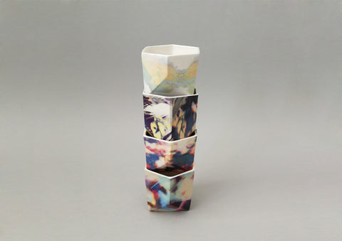
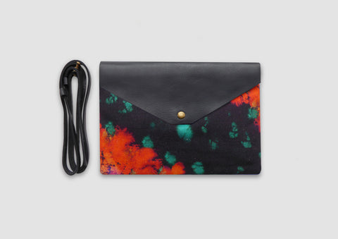
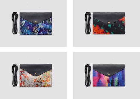
One thing I really love about markets is meeting other designer-makers! I've been on the London market scene for six years now and have built up quite a network of wonderful designer-makers who I often trade with at markets. It's so great to share advice with one another and also be inspired by each other's work. I have also gone on to collaborate with some of the designers I have met which have been great fun! I worked with ceramicist Camilla Webb Carter on a ceramic cup range, and Michelle Wang from MWMakes on a hand-painted leather accessories collection. Both of these collections have proven popular and not only does collaborating mean that you can design collections utilising another creative talent, but you also get to share each other's social networks and spread the word twice as much. Another added bonus is that your collaboration pieces get to go to more events. I'll take the pieces to events I'm taking part in, and vice versa.
I can't emphasise enough that markets are not just about sales on the day. Market days are really unpredictable and so many things can affect them. The weather, bank holidays, school holidays, other big events in the area, the economy, local roadworks, similar traders, trends...
Like many of the retail brands who have started at markets (M&S, Accessorize, Dunelm, Tesco, Oliver Bonas), putting yourself out there in front of people and learning about what products work or fail is crucial. If you drop the price a little, how does this affect sales? If you bulk items together, how does this affect sales? If you display items in a particular way, how does this affect sales?
Like I say in the above slide, 'Have fun and keep learning!'
Be the brand that people remember.
Don't forget to share your social media channels with your customers. Give out postcards or business cards with your website on. Perhaps share a discount code so you can track how many customers are visiting your site as a result of seeing you at a market. Ask people if they would like to sign up to your mailing list. This is a great way to stay in touch with people and share new products, upcoming events or discount codes. With so many brands out there, you need to be visible in as many ways as possible.
I hope this post has been useful and has helped to give some insight about the market trading life of a designer-maker brand. If you have any questions or would like to add a comment below, please do. I'd love to hear from you.
If you're considering organising a pop-up shop, read about how to run a successful pop-up shop here.
Sign up to Samantha Warren's newsletter here.
]]>
Every year I would spend my school summer holiday in the Philippines with my family. It was just the best and was such an exciting place to be. The unpredictable heavy monsoon rain and the farming lifestyle meant that animals who were your friends one day were on your plate the next. I loved absorbing it all: the resourcefulness of the Filipino people - sitting by the roadsides weaving baskets from leaves and tying straw together to make brooms; the flamboyant and musical jeepneys picking up passengers and navigating the busy roads; the vibrantly painted and nippy tuc tucs; the shameless karaoke singing (wow Filipinos can sing!); the loud chattering of locals and the stunning colours of the tropical landscape.
The family jeep.
Having grown up as one of thirteen children in a farming family (which is no mean feat), my mum moved to the UK in search of better opportunities. Since moving to London in the 70's she has worked as a nurse while raising four kids (with my wonderful dad) and is now a grandmother to three chuckling boys.
The experience and memories of my summers in the Philippines, coupled with growing up as the daughter of an immigrant, have had a huge influence on my work and ambitions as a designer. My appreciation of environment and colour, influenced by the vibrant culture of the Philippines, is reflected in the style of my print designs. The practicality of my products is influenced by those talented craftspeople working by the roadsides. The desire to build my own brand, and the work ethic required to do so, come from watching my mother navigate her life as a hard-working woman.
Where my mum grew up.
Writing this post, I've realised how much my mum has shaped not only me as a person but also my business. I think it's interesting for us all to reflect upon how much our mothers have shaped our lives, which is certainly something worth celebrating.
Here's to all the mums out there. Happy Mother's Day.
Thank you for everything, Marcelina.
Sign up to Samantha Warren's newsletter here.
.
]]>
Did you know?
I utilise leather offcuts and discontinued stock from the fashion industry. The longevity of leather is excellent and it ages very well over time, therefore my products can be enjoyed for longer.
The leather offcut on the back of the Alvida bag, £48
My product shapes are clean and simple in order to emphasise my print designs. I am able to minimise waste and use every bit fabric to create my products. Any leftover pieces are made into smaller accessories such as scrunchies, purses and pencil cases.
Ava pencil case, £22
I use natural materials to make my products. My fashion accessories are made out of silk, cotton and leather which are biodegradable materials, unlike man-made fabrics which are difficult to decompose in landfill and are made using chemicals (which will infiltrate into our environment once decomposed).
Freyja silk and leather bag, £48
I use digital printing to transfer my designs onto fabrics. This method of printing has less residual run-off of ink and uses less water than other printing techniques (like screen printing). I am currently looking into natural print and dye techniques to better my business practice and become a more sustainable brand. I look forward to sharing my findings with you soon.
I was recently interviewed by Crafty Fox about my approach to sustainability. You can read the full interview here.
Sign up to Samantha Warren's newsletter here.
]]>
|
|
|
|
|
|
|
|
|
|
|
|
|
|
|
Old logo
I knew I wanted a logo which was classy, something that would stand the test of time, but also look different from other logos and didn't date quickly. I wanted it to relate to my creative work and reflect my modern style, without being complicated. To look traditional but feel new, familiar yet unfamiliar.
Who better to translate my contradictory brief than my typographic designer husband, Tom Foley.
"Samantha needed a logo that would reflect the experimentation and craft that goes into all of her designs and products. It also had to be robust enough to meet the functional challenges of the various production techniques used to apply her logo on to fabrics as well as working on large and small scales in print, web and on screens."
"The all-cap, low contrast basis for the logo is well suited to the many production techniques, scales and outputs required. This approach is common for such technical requirements."
"Conceptually I drew on Samantha's experimental and craft-driven approach to design. If you look closely you will see that no two letters in the logo are the same. This simple yet bold statement reflects her approach and requires a lot of typographic crafting to pull off."
New logo
So what do I think? I love it! Tom did a great job. My new logo is playful and classy and I love the simplicity of it. It’s quite unusual and it’s not very obvious that each character is different, which I really like.
The design reminds me of those travel departure boards with the changeable scrambling letters. I love the collection of unusual shapes, and I love that it mimics a digital code of jumbled digits. The logo perfectly combines major elements of my brand - travel (one of my main inspirations), digital (I use digital technology to create my work and you wouldn’t be reading this without the power of digital) and shapes and pattern (what my designs are all about).
Therefore, I conclude that my new logo meets my brief perfectly. Thanks, Tom!
Sign up to Samantha Warren's newsletter here.
]]>
Part of the annual Brixton Design Trail and London Design Festival, the 'Print your tote' workshop proved popular with designers and locals intrigued to learn creative print techniques.
Using special heat transfer inks and collage, attendees created their own printed bag with some fabulous results.
Thank you to everyone who made it to the event! If you want to find out more about our events, please sign up for our newsletter.
If you're interested in booking Samantha Warren for a creative event, please email info@samanthawarren.co.uk
]]>
The Geo Tropic ceramic range has been specially selected to exhibit at the London Design Festival. The collection is a collaboration between Samantha Warren and the ceramicist Camilla Webb Carter.
The collection also features in the official London Design Festival guide and is continuing to prove very popular in the design scene due to the delicate geometric forms and unusual digitised prints.
See the collection here.
Sign up to Samantha Warren's newsletter here.
]]>
Host the ultimate dinner party with this exciting new range of tableware.
The placemats and coasters combine Samantha's love for texture and pattern with a sophisticated tropical colour palette.
The collection is inspired by Samantha's trip to Mauritius and features beautiful fauna such as palms, alpinia plants and bamboo. The photographs were taken by Samantha and really depict the lush and exotic surroundings.
Each tableware piece is made in the UK using high quality materials from renewable resources. They are easy to wipe clean and can withstand temperatures up to 140 degrees, striking a perfect balance of style and function.
Sign up to Samantha Warren's newsletter here.
]]>Adorned with bold patterns and vibrant colours inspired by tropical wildlife, the 'Geo Tropic' collection consists of four different designs and comes in two sizes - a perfect gift for the stylish coffee lover.
Upcoming events where you can find the collection:
Saturday 7th July 2018, 11am - 2pm - Crafty Fox, Mercato Metropolitano, Elephant and Castle, London
Sunday 8th July 2018 - House of Fraser, Croydon, CR0 1TY
21st - 22nd July, London Artisan, Old Truman Brewery, London, E1 6QR
20th - 23rd September, Tent London, London Design Fair, Old Truman Brewery, London, E1 6QR
Sign up to Samantha Warren's newsletter here.
]]>
Currently there is an exhibition called Orla Kiely: A Life In Pattern at the Fashion and Textile Museum. A beautiful, intimate collection of Orla's clever prints which truly stand the test of time and look incredible on just about any item you can think of.
I just love the Fashion and Textile Museum building.
I don't usually associate Orla Kiely's designs with black but here is a collection which is still very much in her retro and feminine style.
Design studio set up. I'm glad I'm not the only one who can't see my desk while I'm working.
Easy to wear shapes in classic retro Orla Kiely prints.
Oversized printed garments. It was fab to see Orla's prints blown up on a large scale. Really, the motifs are so simple, but Orla has a clever way of repeating simple motif shapes and selecting interesting colour palettes to create an 'Orla Kiely' design which is not only recognisable, but also desirable.
And here I am with the print Queen, Orla Kiely. We met at her exhibition, the same day it was announced that the company had folded. Of course, I am completely gutted. Thank you Orla for all your fabulous work in bringing printed textiles to the attention of the masses and for building a business I am absolutely in awe of. In my eyes, your business was a huge success and it has inspired me to build my own brand and stay true to my design style.
Sign up to Samantha Warren's newsletter here.
]]>
Designed with the chic, practical woman in mind, each bag comes with a handy removable strap - so how you style it is up to you. Take it on your travels and pack it with your phone and passport, or carry it as a clutch to dinner and drinks - Samantha's new accessories are the perfect pick to take you from day to night.
The range has been carefully crafted from leather and cotton and features prints from Samantha's popular Orka collection. These striking designs were inspired by her travels to Iceland and the breath-taking scenery she encountered.
With splashes of vibrant colour - oranges, pinks, blues and greens - these crossbody bags are guaranteed to become your new favourite accessory. We dare you not to desire Samantha's latest launch.
L-R clockwise: Alvida, Ingi, Freyja, Clara
Sign up to Samantha Warren's newsletter here.
]]>
Super soft with a high quality finish and a brass zip, Samantha’s new creations are practical but luxurious.
Named Erica, Ava, Bonita and Sadie, the beautiful bags boast an array of captivating colours, from deep blues, to oyster white, golds and vibrant purples.
And just for that little something extra, the wristlets are customisable with a choice of four leather coloured straps - pick from black, gold, rose gold, or hologram (Samantha’s personal favourite) to complete the look.
The perfect pouch in which to pop a lippy before a night out, Samantha Warren’s new bags are already proving popular on the party scene. Retailing at £55 and available at samanthawarren.co.uk, they make a great gift (or a perfect personal pick-me-up).
Sign up to Samantha Warren's newsletter here.
]]>
I designed a fun and hands-on workshop which was suitable for all ages and artistic abilities. The workshop ran as a ‘drop-in’ creative workshop which meant that the activity had to be simple enough to pick up quickly, but interesting enough to entertain those who took part and enable them to enjoy being creative.
I designed an arty workshop that incorporated a lovely wax resist technique. This involved creating artwork with wax and using watercolour paints to reveal the design left as a result of the wax resisting the paint. Attendees designed their own unique Christmas gift boxes which they got to take home with them.
I was very fortunate to have the gift boxes donated to me by a Spanish packaging company called Self Packaging. If you’re looking for special packaging solutions, please do check them out.
If you’d like to hear about future creative workshops and events, please check out my events page or sign up to my mailing list.
Sign up to Samantha Warren's newsletter here.
]]>
Read more to find out what goes on behind the scenes in designing our latest collection.
Our Design Process.
Drawing days at the Horniman Museum, Forest Hill, London
Futurism Exhibition: Giacomo Balla, Estorick Collection, London and workshop with textile designer Faye McNulty
Design development and refining a colour palette.
Experimentation with our research. Combining our hand painted designs with collage and photography.
Building the collection.
Continuing to develop our designs using our sketches and photographs in the colour palette.
Further refinements lead us to select four final designs. Ta daa!
The hand made silk and leather collection can be found here. You can also customise your bag by choosing one of our coloured leather straps, including a hologram leather! Our favourite.
Sign up to Samantha Warren's newsletter here.
]]>
Thank you to my latest stockist The Towner Art Gallery It hosts one of the most significant public art collections in the South of England and has chosen my products which sit perfectly with their current exhibition Jessica Warboys, Echogap
Sign up to Samantha Warren's newsletter here.
]]>
This is the oldest bag in the museum and is from the 16th Century, France. It is made from goat leather and has 18 pockets! It has two loops on the clasp, probably linked to a belt, and was likely worn by a merchant. Some of the 18 pockets are concealed and it’s thought that this tricked thieves trying to steal from the merchant.
Men carried bags long before they became fashionable for women. They would be carried to transport and store hunting equipment, a practical necessity long before the desire to wear a bag for style purposes.
Letter cases were popular in the 1700-1800 for keeping love letters and bills. Usually made from leather, silk or straw and embroidered with metal thread or silk. Letter cases were often given as gifts for weddings and engagements. Although not really a bag, the concept of having a decorative object to carry something of importance was required.
Decorative bag handles. Bags were becoming fashionable and these themed carvings show that they were becoming more of a statement piece. They were no longer just for practical reasons.
Beaded bags were popular in 1700-1800 and could take about two solid weeks to hand make. Each coloured bead is individually threaded before being knitted into a bag. We can really see the level of detail in these elaborate designs. This style of bag was very expensive and it would be a privilege to be seen wearing one of these. It was an accessory for the very wealthy.
This is a really fascinating object. A chatelaine was a symbol of power for the medieval lady of the manor. Evolving through the years, a lady would hang her valuables such as her bible, keys, purse, fan, sewing box. These went out of fashion in the early 1900's when the handbag arrived. It's basically the contents of a bag hanging off of chains, like an inside out bag.
Ivory parcel carrier with silver rings. Early 1900. This is a precursor of the plastic bag. To use this, you would tie what you wanted to carry onto the handle rings. Quite an interesting concept and it could really challenge the idea of the 'bag for life.' Have a handle and string for life instead!
I begin my blog by giving you a warm welcome to my new website, I hope you like it. So far so good, and I am really happy with Shopify and all of the features available. The site is much slicker now and hopefully easier to navigate.
Sign up to Samantha Warren's newsletter here.
]]>