Five years ago, I designed my first logo with my brother. It has suited me very well until now, but I decided that I wanted a more meaningful logo which represented my design ethos and felt more relevant to my brand.

Old logo
I knew I wanted a logo which was classy, something that would stand the test of time, but also look different from other logos and didn't date quickly. I wanted it to relate to my creative work and reflect my modern style, without being complicated. To look traditional but feel new, familiar yet unfamiliar.
Who better to translate my contradictory brief than my typographic designer husband, Tom Foley.
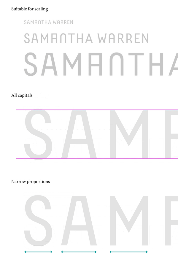
"Samantha needed a logo that would reflect the experimentation and craft that goes into all of her designs and products. It also had to be robust enough to meet the functional challenges of the various production techniques used to apply her logo on to fabrics as well as working on large and small scales in print, web and on screens."
"The all-cap, low contrast basis for the logo is well suited to the many production techniques, scales and outputs required. This approach is common for such technical requirements."

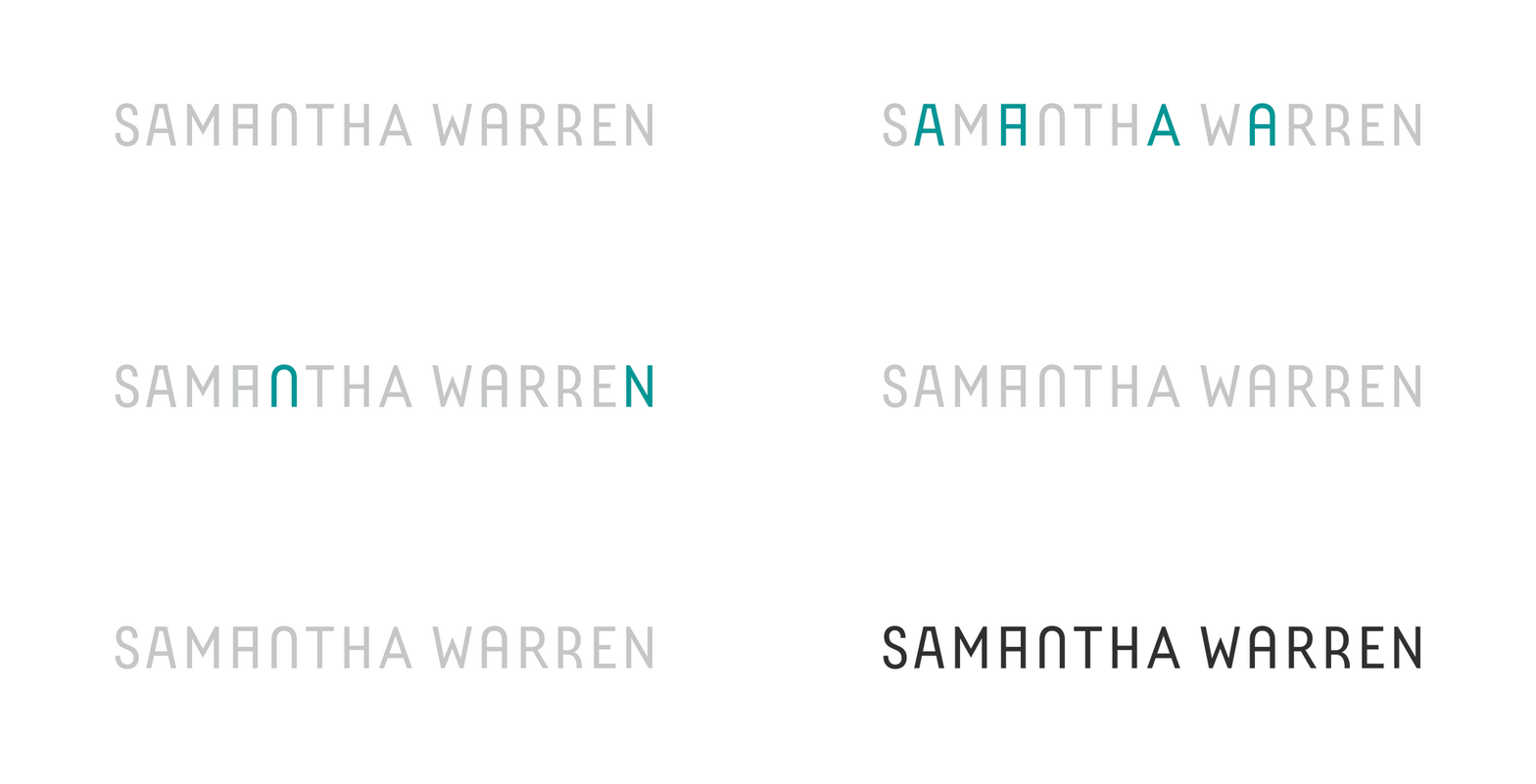
"Conceptually I drew on Samantha's experimental and craft-driven approach to design. If you look closely you will see that no two letters in the logo are the same. This simple yet bold statement reflects her approach and requires a lot of typographic crafting to pull off."

New logo
So what do I think? I love it! Tom did a great job. My new logo is playful and classy and I love the simplicity of it. It’s quite unusual and it’s not very obvious that each character is different, which I really like.
The design reminds me of those travel departure boards with the changeable scrambling letters. I love the collection of unusual shapes, and I love that it mimics a digital code of jumbled digits. The logo perfectly combines major elements of my brand - travel (one of my main inspirations), digital (I use digital technology to create my work and you wouldn’t be reading this without the power of digital) and shapes and pattern (what my designs are all about).
Therefore, I conclude that my new logo meets my brief perfectly. Thanks, Tom!
Sign up to Samantha Warren's newsletter here.

Leave a comment